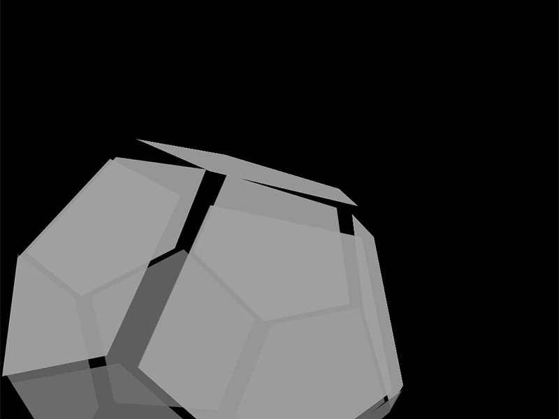
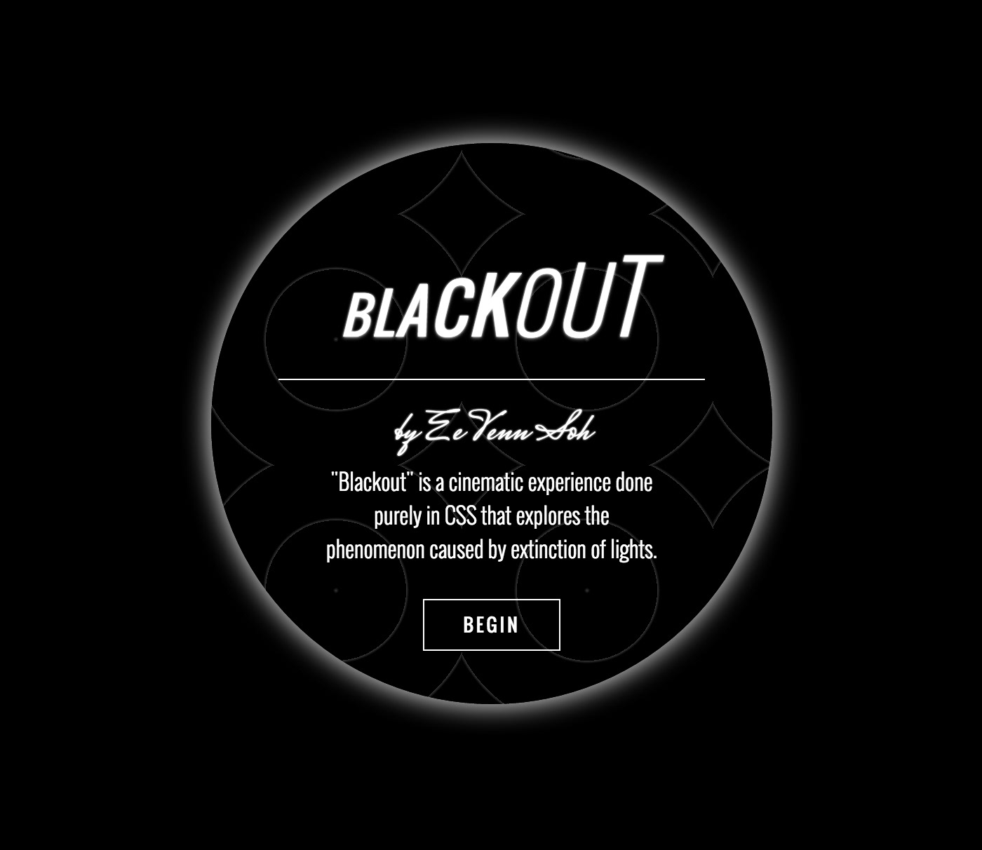
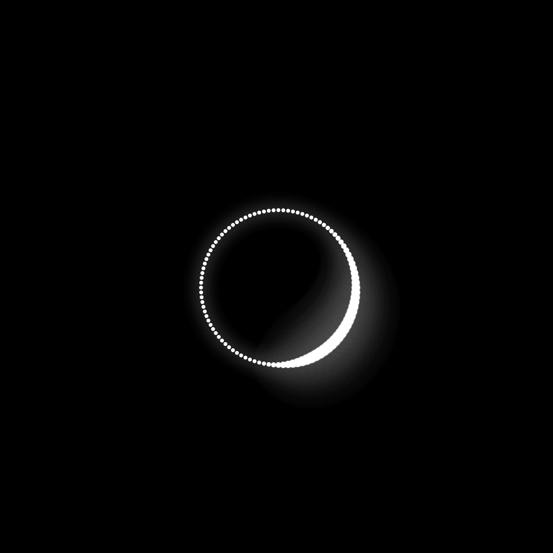
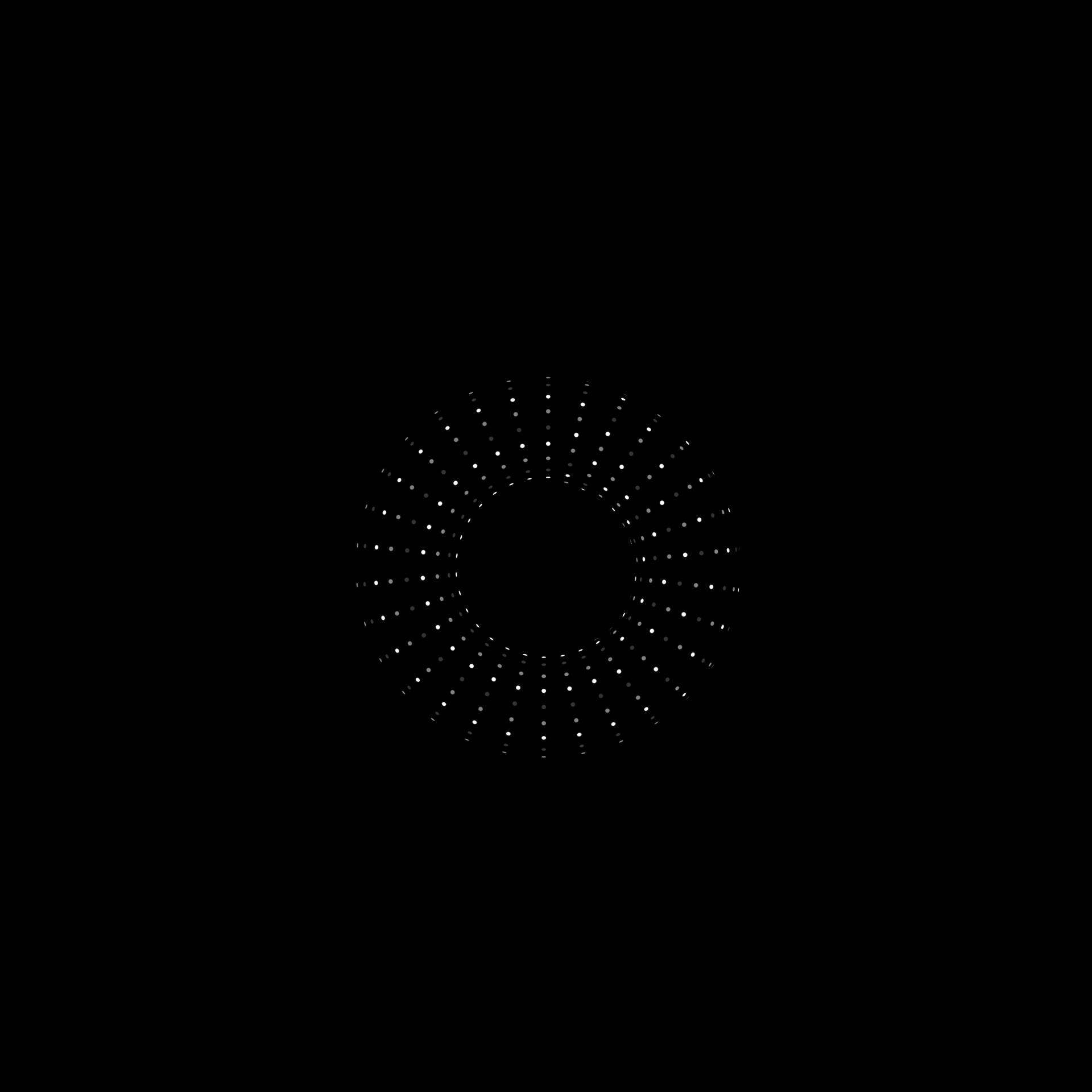
"Blackout is a cinematic experience done purely in CSS that explores the phenomenon caused by extinction of lights"
Given that the web has started to mature, I am amazed by how much and how far CSS is capable of. Every now and then, I get blown away by what you could achieve with CSS. So I went away and started thinking what I could do. And this is it, an experiment purely in CSS. The title of this project is “Blackout”. Don’t ask me why I chose that name 😂 but hopefully there are enough visual cues that could clue you in.
Creative brief:
• 100% CSS
• No images / No other web technologies
• Motion / Cinematic experience, 3 ~ 4 scenes
• Super awesome
• No images / No other web technologies
• Motion / Cinematic experience, 3 ~ 4 scenes
• Super awesome
(Note: This is a just-for-fun project and it is not feasible for actual deployment as there are many performance issues. There are better technologies for similar output)
Motion


Visual

Inspiration
There are few people out there that I would like to credit. Ana-Maria Tudor, Hakim and Simurai. I got a lot of inspiration by just looking at what they have done. Normally what I will do is that I will go through a whole bunch of CSS experiments and if there is one particular effect that I really like, I will copy it, decipher it and build my idea on top of that.
Ana Tudor has been especially helpful and patience with all those questions I had about the math behind the polygon.
I use codepen a lot. It is a playground for creative coders to showcase their experiments. It is like a gallery of cool web stuff.
Ana-Maria Tudor - @thebabydino
Hakim El Hattab - @hakimel
Simurai - @simurai
Help & Support
Stackoverflow - Community for programmers
Twitter - Contact the author of the experiment for explanations
Documentation - Personal knowledge base
Twitter - Contact the author of the experiment for explanations
Documentation - Personal knowledge base
Google - You get it
I can't help but emphasize how useful it is to document every single learning and every single piece of web technology you have come across. I don't get the luxury to work on code every day and by having a repository of resources I could refer to prove to be really valuable to bewield the ever changing landscape of the web.
(Screenshot: This is only a small chunk of documentation throughout the years on the topic CSS)

Dev environment & Code architecture
Tools:
• Google Drive (Hosting / Syncing)
• Sublime Text (Code editor)
• Grunt.js (Tasks automation)
• Autoprefixer (Vendor prefixes)
• SASS (CSS)
• HAML (HTML)
• Chrome’s Workspace (Save changes in browser that will persist through local)
• Chrome’s Sourcemap (Debug SASS in browser)
• BEM (CSS naming)
• Sublime Text (Code editor)
• Grunt.js (Tasks automation)
• Autoprefixer (Vendor prefixes)
• SASS (CSS)
• HAML (HTML)
• Chrome’s Workspace (Save changes in browser that will persist through local)
• Chrome’s Sourcemap (Debug SASS in browser)
• BEM (CSS naming)
With Google Drive desktop, I get the syncing capabilities. So I did all my coding directly in Google Drive and I am able to work on the latest code at the agency or back home. Ya, I know I could use bitbucket or github but since this is just a 1 man team and just a small project, I have decided to try something different.
I started off using Compass for SASS but soon I get into the problem of having not up-to-date mixins and missing/broken mixins like (keyframes rule, animation syntax that can't accept more than 1 keyframe).
Prefix-free by Lea Verou is cool but it is using a client side library (performance issue). Autoprefixer proves to be the life-saver. It uses latest data from caniuse only add prefixes when needed, build CSS with prefixes during project deployment, I can now write CSS in W3C standard and there is a Grunt plugin!
You have to be a SASS power user for this project. I have tapped into areas like SassScript, @-Rules and Directives, Control Directives and Expressions.
You have to be a SASS power user for this project. I have tapped into areas like SassScript, @-Rules and Directives, Control Directives and Expressions.
HAML is used to write the HTML. It is equivalent to SASS for CSS. I have to use the for loop syntax to generate hundreds of DOM elements for animation. It will be really painful to write HTML manually for this project.
BEM, Block, Element, Modifier is a principle. It enforces a naming convention and forces you to write more flexible and modular CSS.
Optimization
I won't get into the details. I haven't optimized my code for this project except for simple quick wins like minify your code (Compass :compressed output) and uncss.
Of course, you could also try forcing layer creation by using translateZ(0) or translate3d(0,0,0) on parent element. Forcing layers ensure that the layer is painted and is ready to go as soon as animation starts. However, there is a new CSS syntax that will make this fix obsolete, "will-change".
Jankfree is a really good website about performance and optimization managed by people from Google.
Chrome Dev Tools are awesome. You can trigger the "Show paint rectangles" to see the region to diagnose and avoid unnecessary paints on a page. Trigger “Show composited layer borders” in Chrome to determine whether the element is sitting on its own layer. Again, for this project, I don't have a performance budget. It is purely a visual feast.
The more you understand performance the more it influences your design thinking and make you reconsider your design and development habits and principles. Like for design, if you apply drop shadow + radius corner to an element, that is a performance hit.
For development, if you are going to move an element across the screen, if you animate the top or left properties instead of translateX or Y it is another performance hit.
Summary
Learnings:
• Creating so many DOM elements and animate them is unrealistic.
• Doing complex animation through CSS is laborious. Use Greensock GSAP instead and you don't have to worry too much about optimization. You are covered.
• Synchonize timing through CSS is hard. Can be painful if you change the timing of 1 element. The timing has to be cascaded down. Again, use GSAP, it has Timeline.
• Mix CSS and JS animations. If you are going to have 1 shot, encapsulated transition, use CSS. Leave complicated animation for GSAP.
• Creating shapes in pure CSS is painful, use SVG instead.
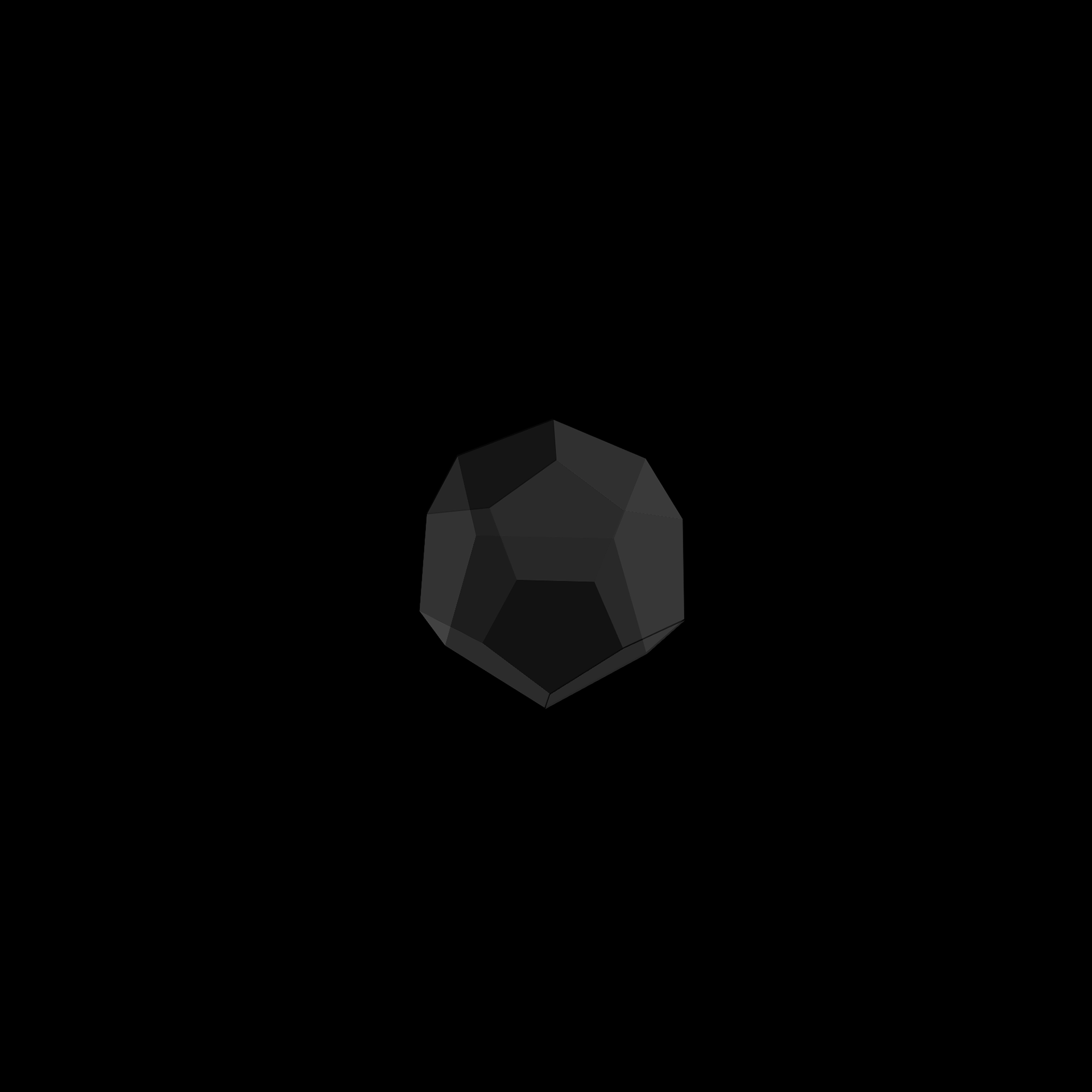
• Even as an Asian, I find the math extremely mind boggling. The math behind the last polygon scene took me a while to figure out (with the help of Ana Tudor).
Mentioned in the media:
Code & Live preview