The most fluid, delightful and intuitive experiences were always the ones that put detail into a well planned and purposeful animation. It captivates your audience and permeates the design with a moment of wonder and a sense of superb craftsmanship.
It encourages deeper exploration of a design. It helps add a tactile element to interactions because it makes you forget you may just be tapping a piece of glass and instead makes you feel like you’re interacting with real elements on the screen. It’s nice to feel like things are reacting to what you’re doing. They appear tangible, even though they are behind a layer of glass (the device screen).
A well-considered animation influences people’s perception and trust in your product. They are more than just a good user experience. They have emotional appeal which overall creates a more positive and enjoyable experience.
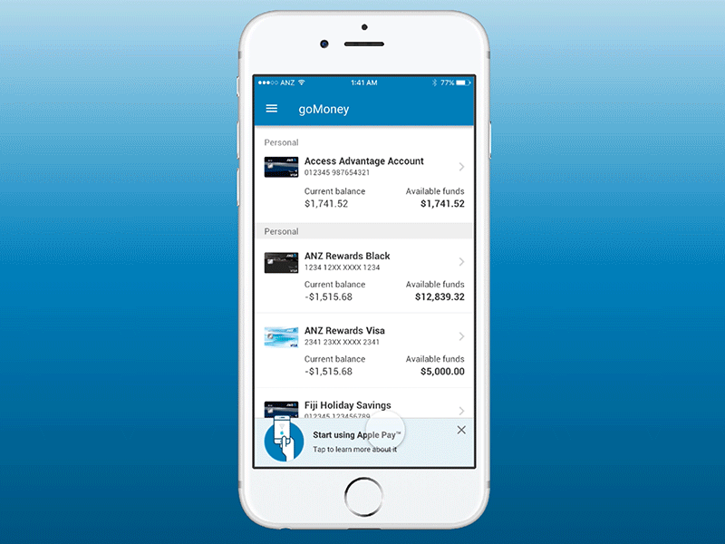
Prototypes
A small selection of prototypes across different projects that I have done.

Motion principles
1. Motion should be used to communicate meaning
One purpose of motion within goMoney is to help guide users through the app. Superfluous animation could make users feel disoriented, and also make the app feel less polished (star-wipes anyone?). Consider where the user is, where they're going and the purpose of the element's animation.
It will usually fall into one of the following categories:
• Educate
• Inform
• Entertain
• Engage
• Orientate
2. Motion should be simple and be used sparingly
It's really easy to get carried away by over animating elements. Look for key, impactful moments where motion can be used to bring the app to life. For example, it might be at the start of an onboarding process, to get the user excited or at the end of an application process, to reward the user's effort.
3. Motion should consider the user's emotional state
Is the user feeling anxious? Or are they confused? Try to use motion to help turn their negative emotions into positive ones, or amplify pre-existing positive states. For example: subtle animations in an empty state can make the user feel at ease. Rewarding the user with a bit of delight after completing a task can make them feel even better about its completion.
Key tones
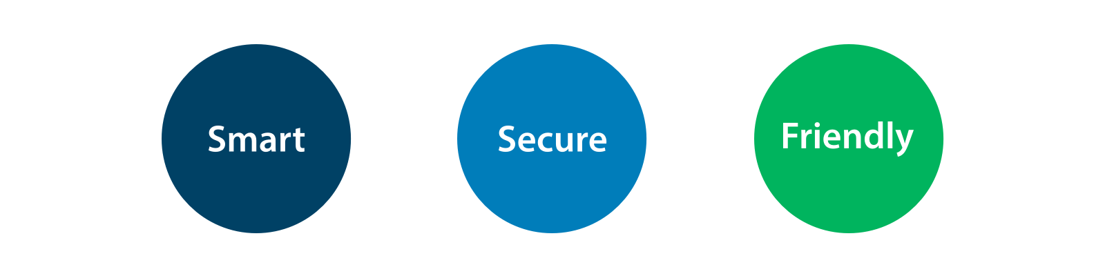
Smart
When should motion be smart?
Motion with a smart tone should be considered for core interactive components of the app – those with more utilitarian functions, where it isn't suitable to be too playful. This type of animation can also be used to mask any technical flaws or imperfections. Eg: form fields, tumbler/carousel components, transitions, loading animations, buttons, validation messaging, notifications or toggles.
Secure
When should motion convey security?
Whenever the user is making a payment, verifying their identity or performing a serious task, we should try to portray security through the motion of the elements they interact with. This tone of animation will be a lot more solid, systematic and stable than the other tones. The aim of this is to assure the user that everything is locked down and under control.
Friendly
When should motion be friendly?
This tone is reserved for more lighthearted interactions rather than serious ones. Playfulness and delight can often amplify pre-existing feelings of happiness/satisfaction. Eg: onboarding messages, empty states, icons, some modals/dialog boxes.
Design audit
Mobile
Performed a design audit to look at the main flow (page-to-page) of the app and assigning a key tone to each of the screen.
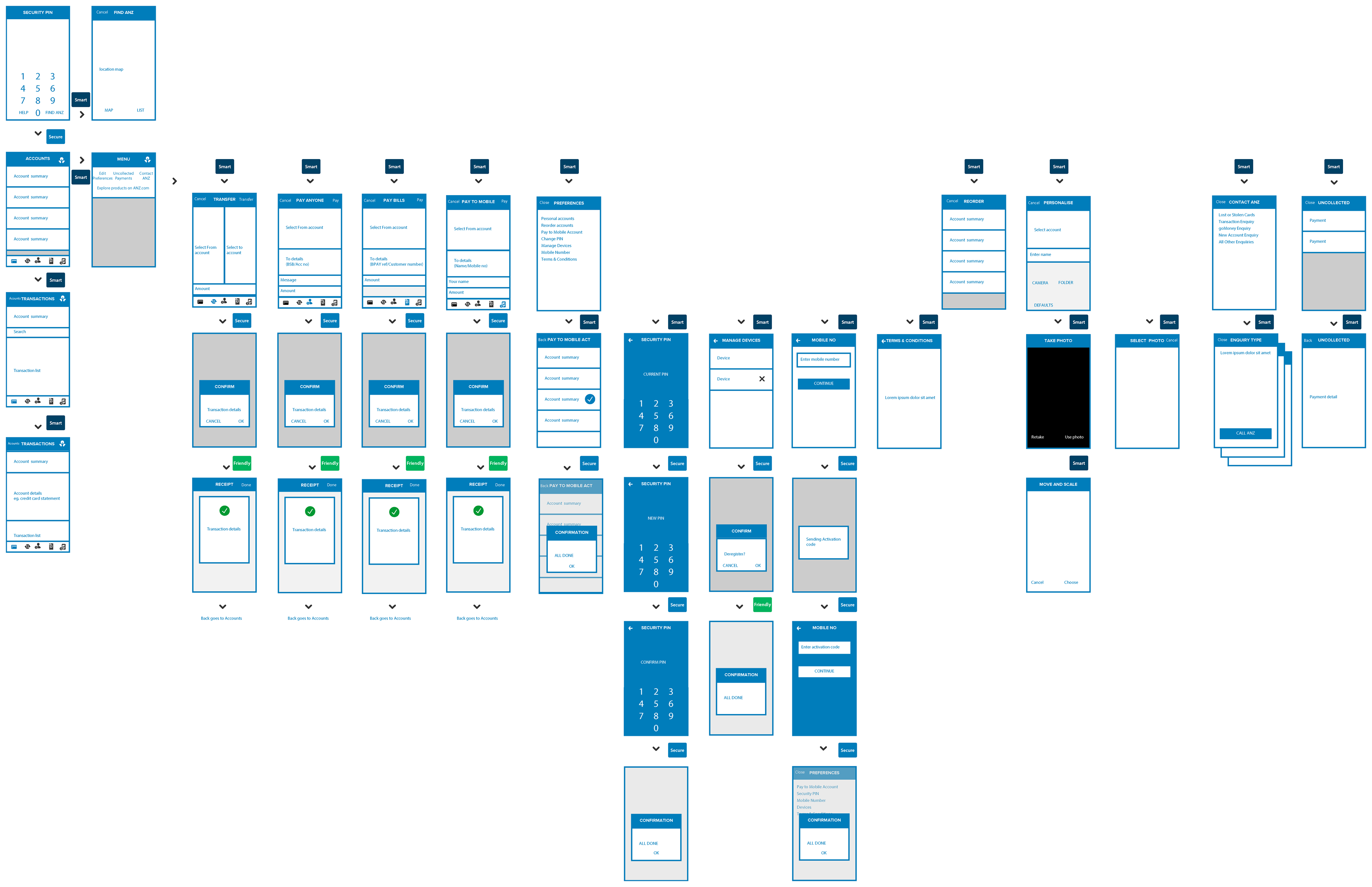
Other digital channels
Designers from other digital channels were tasked to perform similar audits. During our weekly sprints, we will gather and discuss the patterns that have been established and further refine them. The objective is to propose a consistent motion building blocks that are versatile across different digital channels.
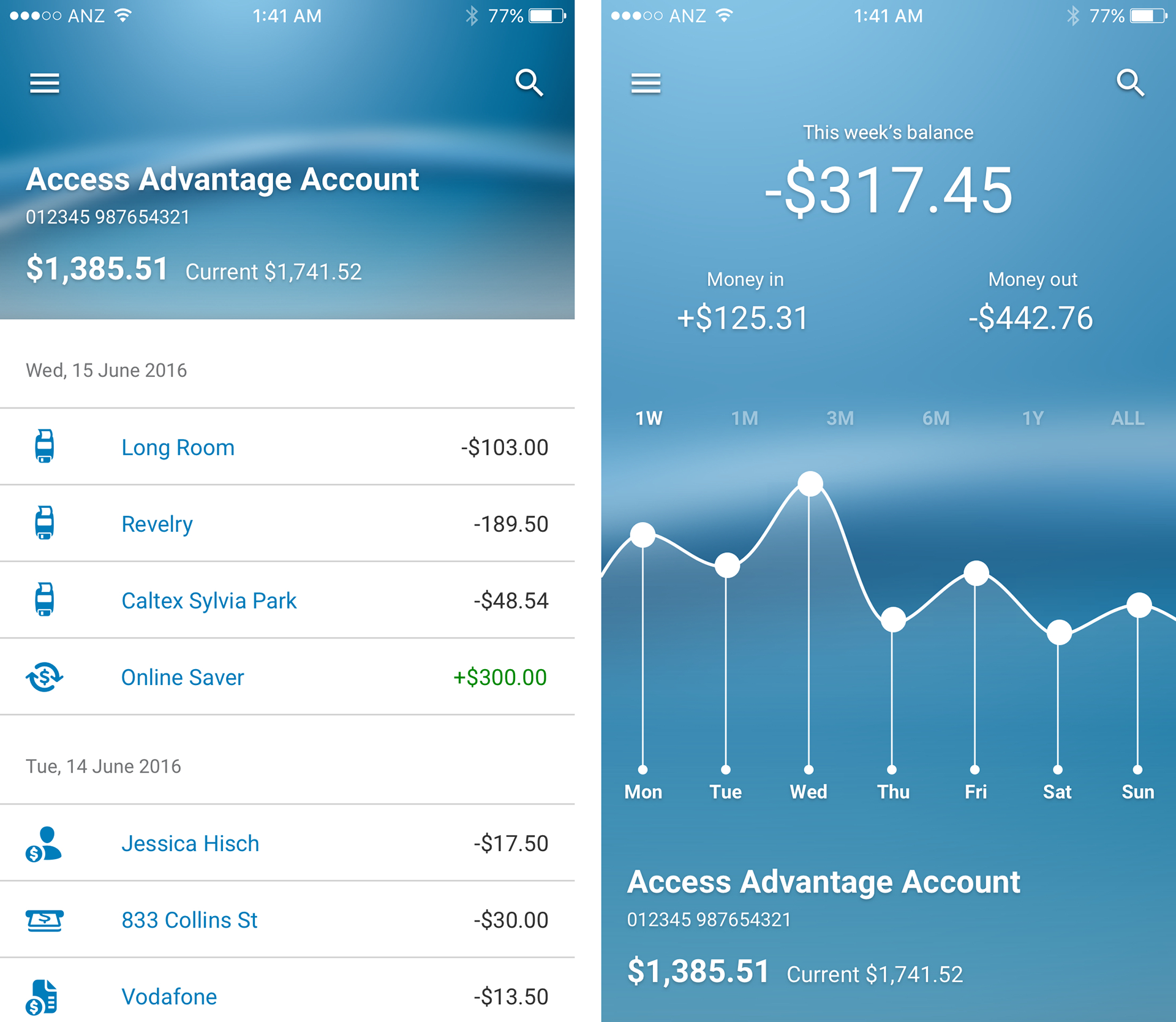
Valence vs Arousal
We monitor the emotions of each of the design pattern across a bipolar scale defined in a continuous dimension ranging from pleasant to unpleasant. By studying the behaviour of each pattern through user testings, we are able to plot them on the chart and design them more appropriately. We separate screens that get triggered on a "good" emotion or "bad" emotion within a range of arousal magnitude.
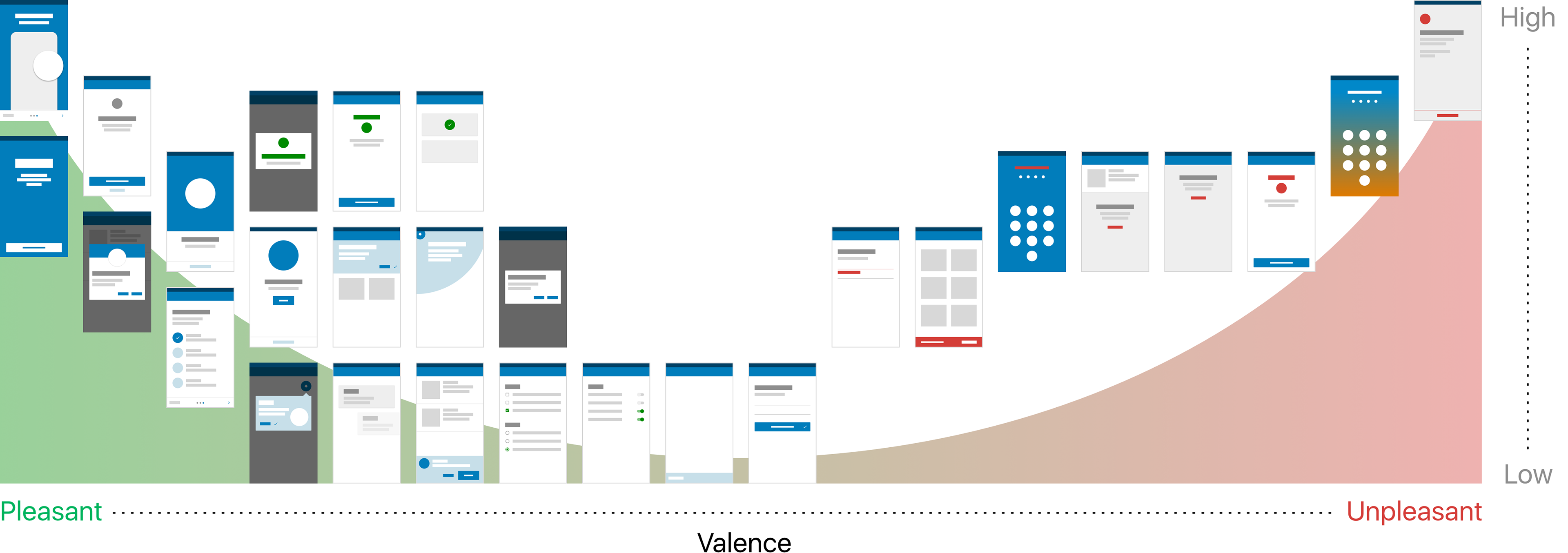
The screens are constantly tested with user testings and re-plotted on the chart.
Payment flow
Each screen will have a certain personality traits and it is contextual and it adapts to the moment.
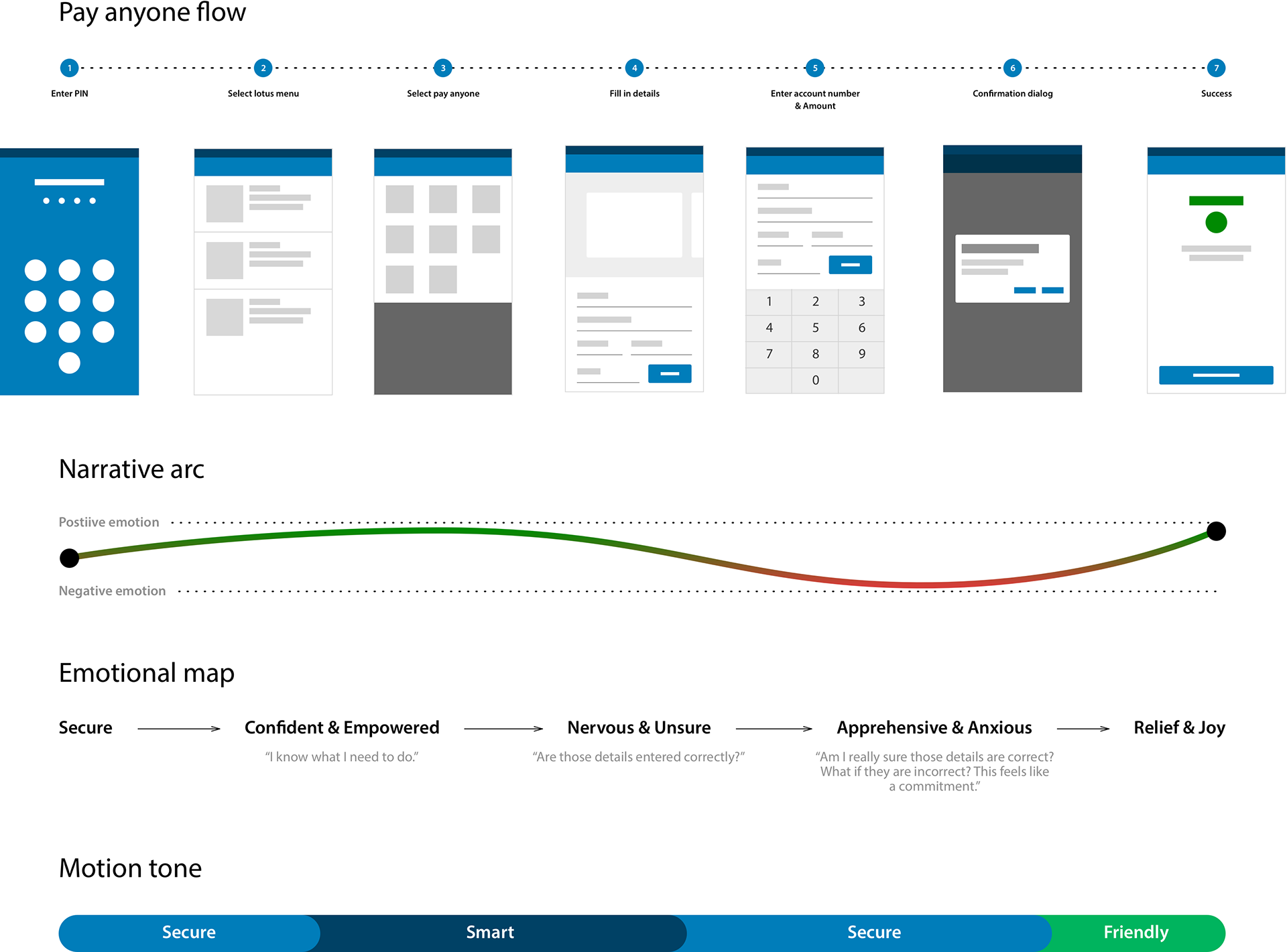
An example of how we mapped the payment flow according to individual screen's emotion.
Gesture
The ease and functionality of a mobile device is shifting the way we think about interactivity. It is ushering in a new age of UI that favours a more direct form of interaction. In ANZ, gestures are more than merely entertaining, they are useful. We investigate different touch mechanics on different contexts. We propose gesture-based controls that are natural, or at least can be picked up quickly.
Gestures help pave the way for more meaningful interaction as it enables speed in user action once it is learned.
Research
We look at what happen when you start performing a gesture event. Eg: When you start dragging an element, during the drag and end of the drag.
We also explore the idea on progressive learning. How easy is that for people to learn a gesture? Once people start learning this new gesture, successfully create a habit forming action. Can we safely remove the UI?
Challenges:
• The biggest downside of the gesture controls is a learning curve. Every time you remove UI clutter, the app’s learning curve goes up. This happens because gestures have a lower discoverability.
• Lack of feedback too as you aren’t sure if it works or not.
• No consistent pattern for gesture.
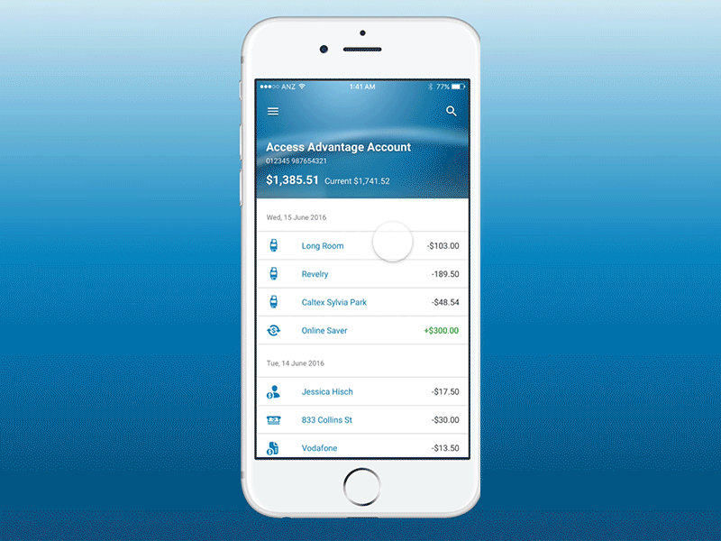
Quick balance
A quick way to check your balance on the go on selected accounts. Always have your balance one swipe away so you take out the guesswork with your money without even login in.
Research
In our UT for gesture, we don’t want to create gesture just as a secondary form of interaction for power users. We want to understand the context they are using it and propose the most comfortable and intuitive gesture.
There are some really interesting points around how one user played basketball and injured his hand and he needs to check his balance quickly without login in. So this short term injury is changing how he uses the product.
And sometimes the it can be situational eg: like you are in a really loud environment, or there are many people walking around you, you don’t want to key in your password. Or you are doing your grocery, you have only 1 hand.

Dashboard
An edge swipe from the top to quickly reveal a summary about the user's spending.
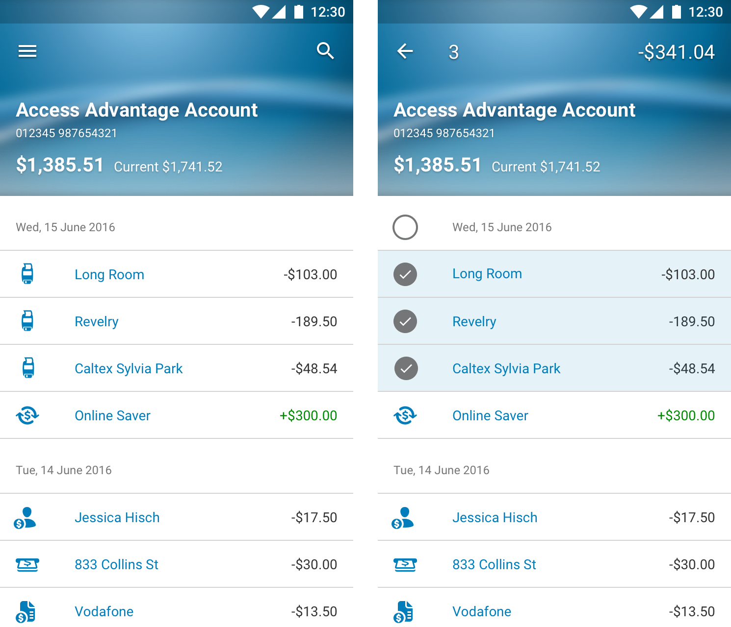
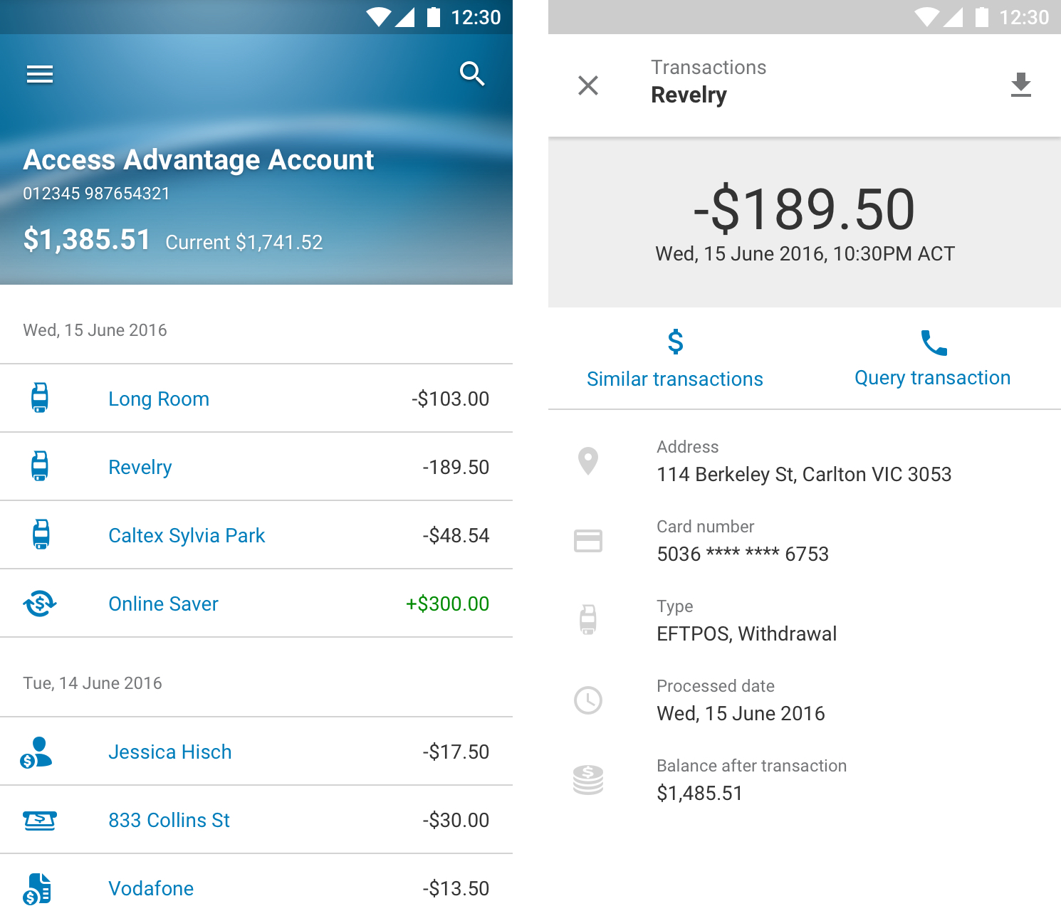
Multi selection
Selecting multiple transactions will give you a quick total of a user's spending.
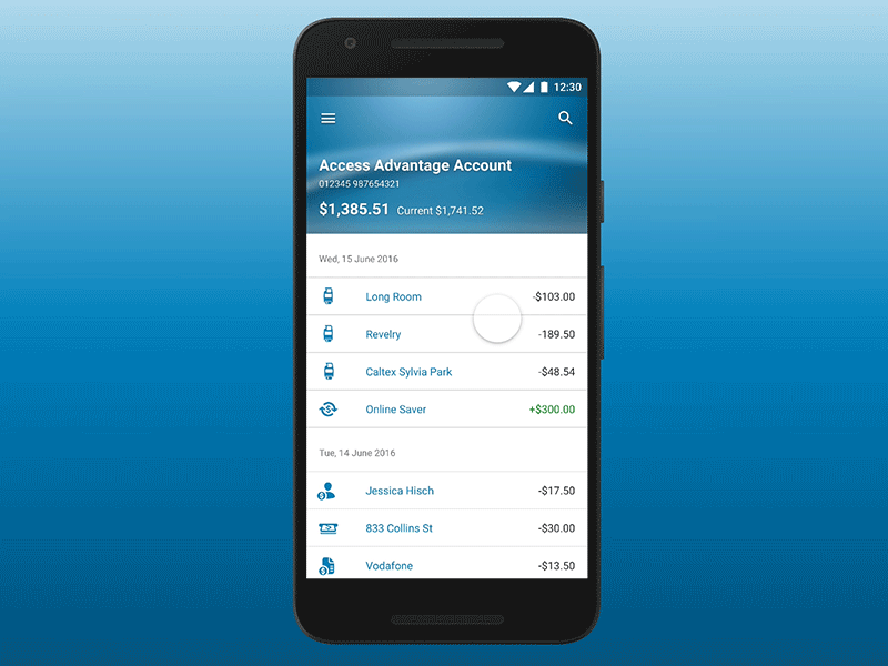
Transaction details
A google-inbox esque interaction. A quick tap on a transaction will get you further information about a particular transaction. A drag on it will dismiss it.

Scrolling
As the user scrolls through the transactions, the masthead will slide off along with the status bar and the date label will anchor to the top of the screen. If the user prefers to plough through the transactions, interacting with the scrolling device will give the user the ability to quickly jump to a preferred timestamp.

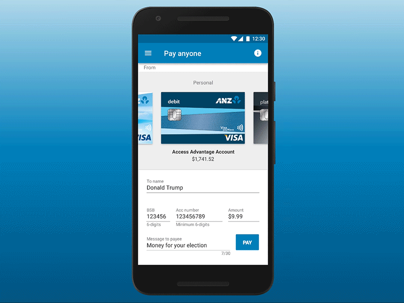
Transferring funds
Transfer funds is the most used feature in goMoney app. Hence it makes to introduce a drag and drop gesture for a quick transfer of funds between accounts.
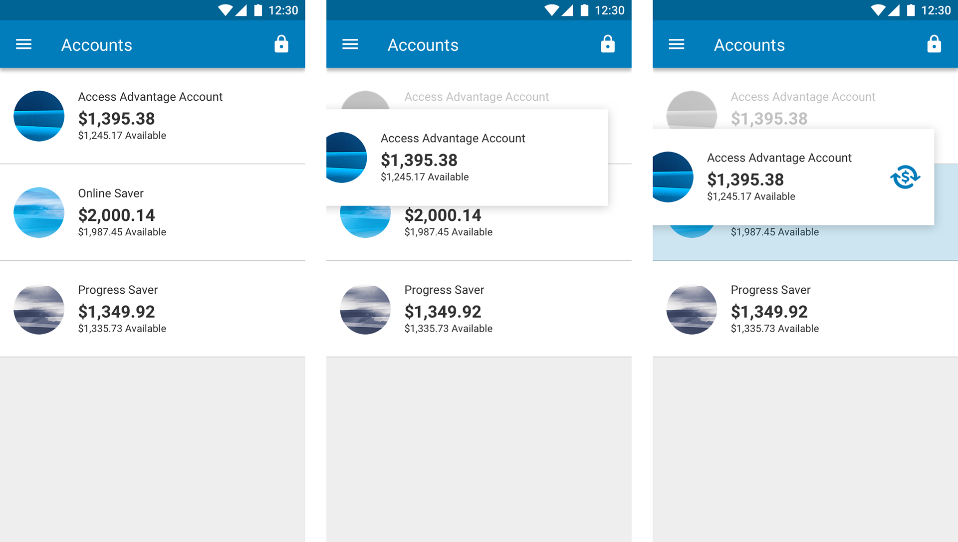
Re-order accounts
Re-ordering accounts into the user's preferred hierarchy. When the account is dragged, it will transition into a contained pill size to visually signify an easier droppable action.
Prototyping tool
Prototypes are done using my personal prototype build tool using mainly Framer.js and GSAP as the foundation. It is code oriented and open to future technologies such as other APIs integration, AR/VR and is able to tap into native functionalities of a device such as gestures, force touch, gyroscope, accelerometer, etc.
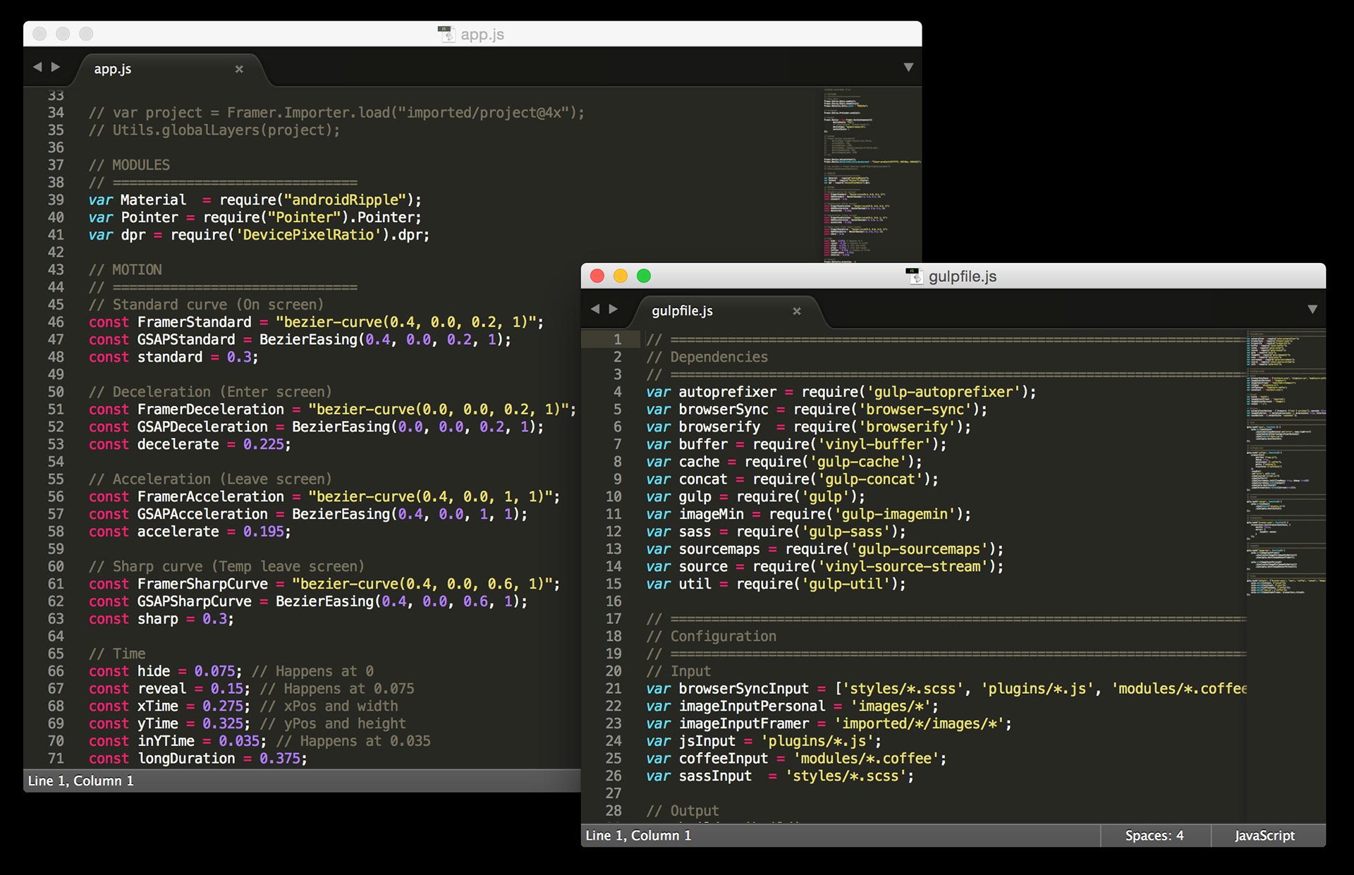
Coding environment using Framer.js and GSAP.

Design attributes are constantly updated on Confluence. It is the source the truth for designers and developers.
Motion brief
Sometimes we will create a particular animation using After Effects or other prototyping tool that is hard to articulate in coding sense. Scrubbing through a video back and forth wouldn't help the development much. Hence a motion brief with clear annotations and specific animation details is given to the developers for ease of build.
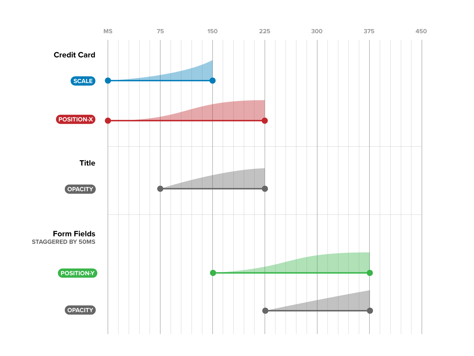
Depending on the development team and code architecture. A motion brief will be less relevant if the development team is using an AE to native animation converter library.
After Effects to iOS and Android animation converter:
Airbnb's Lottie: http://airbnb.design/lottie
Facebook's Keyframes: https://github.com/facebookincubator/Keyframes
Marcus Eckert's Squall: http://www.marcuseckert.com/squall/
Hernan Torrisi's Bodymovin: https://github.com/bodymovin/bodymovin
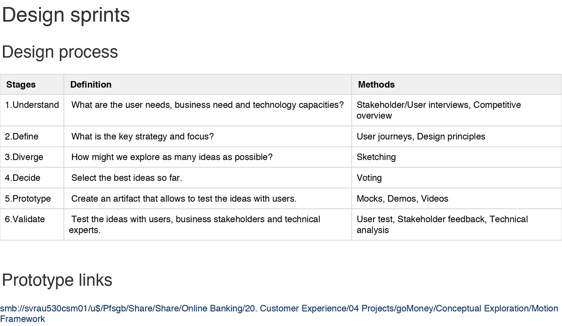
Design sprint
We have adopted Google design sprint methodology. It is simply a structured brainstorm based on design thinking and agile development. https://developers.google.com/design-sprint
All the process are documented within Confluence.
Sprint process.
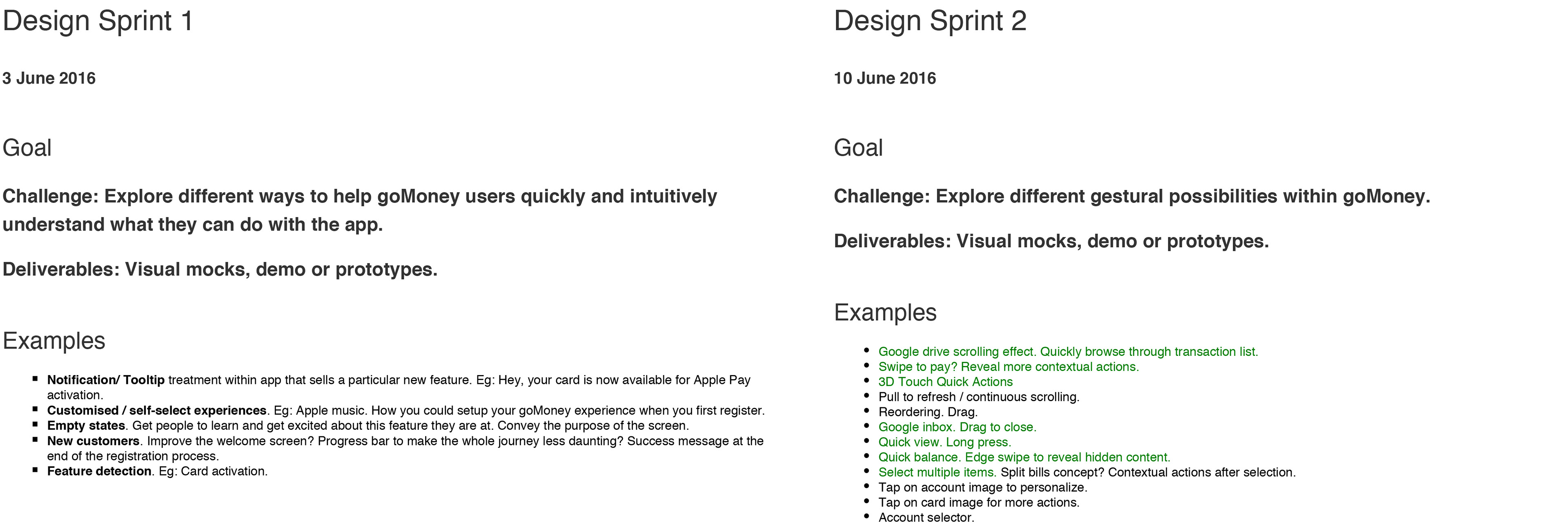
Snapshots of sprint planning.
Storyboard
During the diverging phase, we explored tons of ideas with pen and paper. If there is an idea that warrants further expression and details, we will work on it further. We will flesh out ideas with their respective key motion steps.
Mobile
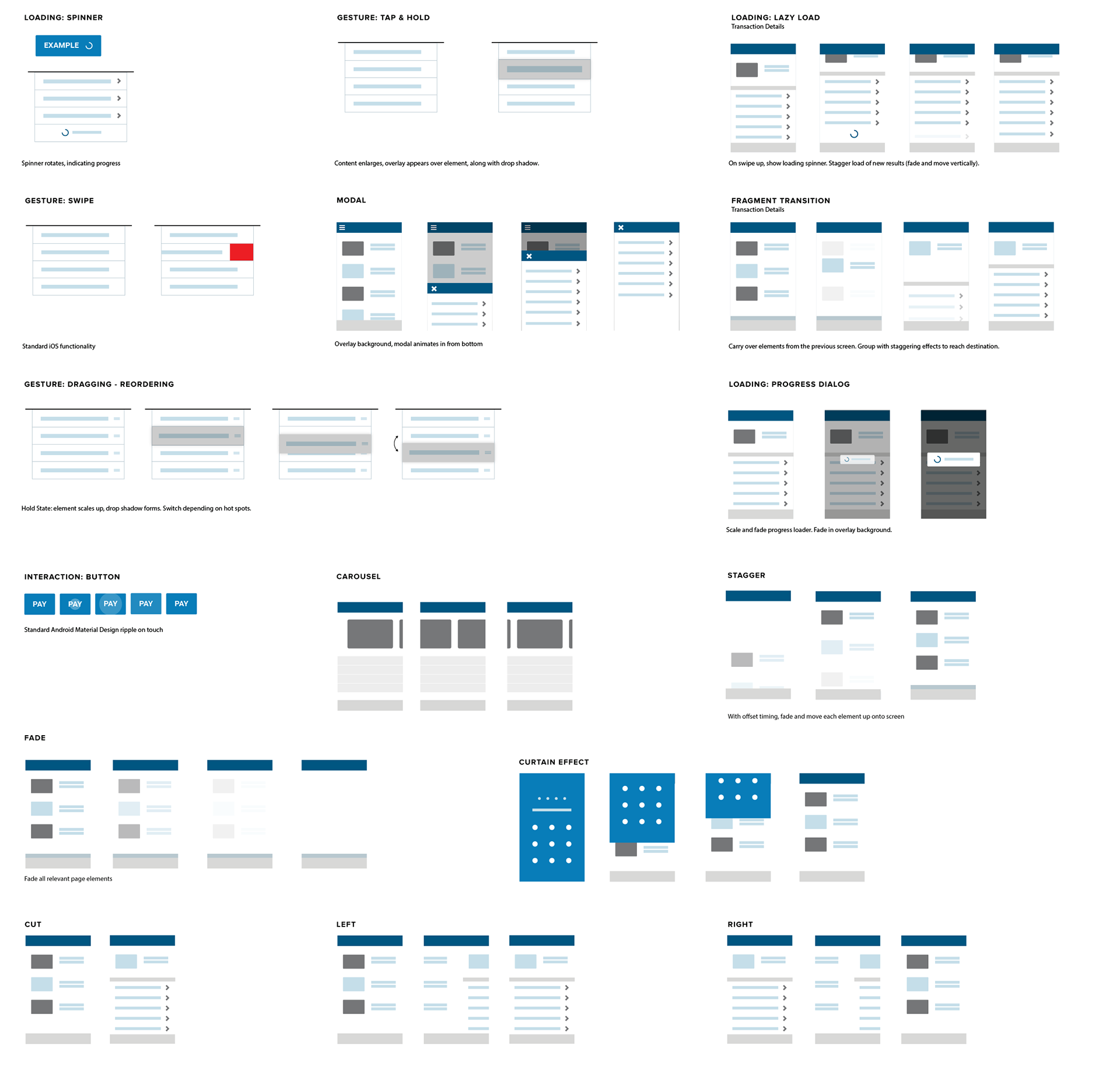
Patterns
A series of patterns were vetted through user testings and the design team. They are constantly improved, refined and serve as building blocks for detailed design.
Mobile
