One of the major tasks ANZ has taken in recent time is to uplift the much dated Android goMoney mobile UI to a more modern and sophisticated design. The design direction is largely influenced by Google Material guidelines. We believe it is a visual language that synthesizes the classic principles of good design with the innovation of technology.
I am the primary point person for our product design standards & guidelines, ensuring consistency, scalability, and modernity of elements and patterns. Determine appropriate use of patterns as well as when to evolve them or leave them behind entirely. (while updating our style guide and documentation accordingly).
With the establishment of a design system, product design simply becomes a matter of combining our established templates and components, much like lego bricks. This frees us to focus on user experience, problem solving, and building meaningful experiences.
Design challenges:
• Android goMoney app is built upon an old platform with legacy tech debts. Hence the deal is to restrain from major experience uplift until we migrate to a new code base.
• At that point of time, ANZ doesn't have a visual and comprehensive styleguide for their mobile ecosystem.
• The existing design components aren't robust and flexible enough across different context.
• The app is plagued with variants of visual pollutants that are redundant.
• Tons of customized UI patterns and components instead of using natively available Android UI patterns.
• Redtapes and premature design process within the organization.
• Design tools procurement friction. Slow migration to trial design tools like Sketch.
• We need to consider more broadly how the system will work across different channels. And this is not just for UI elements, we need to think about motion, illustration, content and imagery in a broader scale.
Structure
Process
Whenever there is a new screen that needs to be built, the screen will be assigned to a design template. A design template can comprised of different design components. The business analyst will create a story for the developers along with detailed explanation of the design specs and interaction prepared by a designer.
Templates & Components
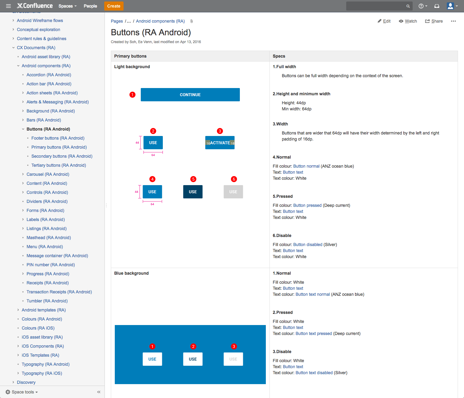
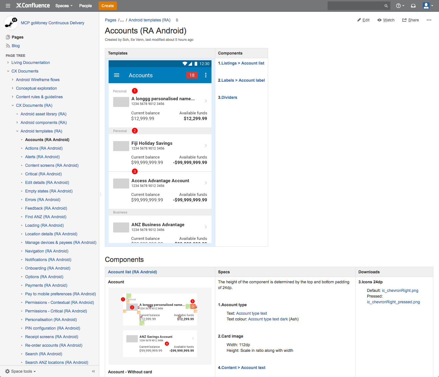
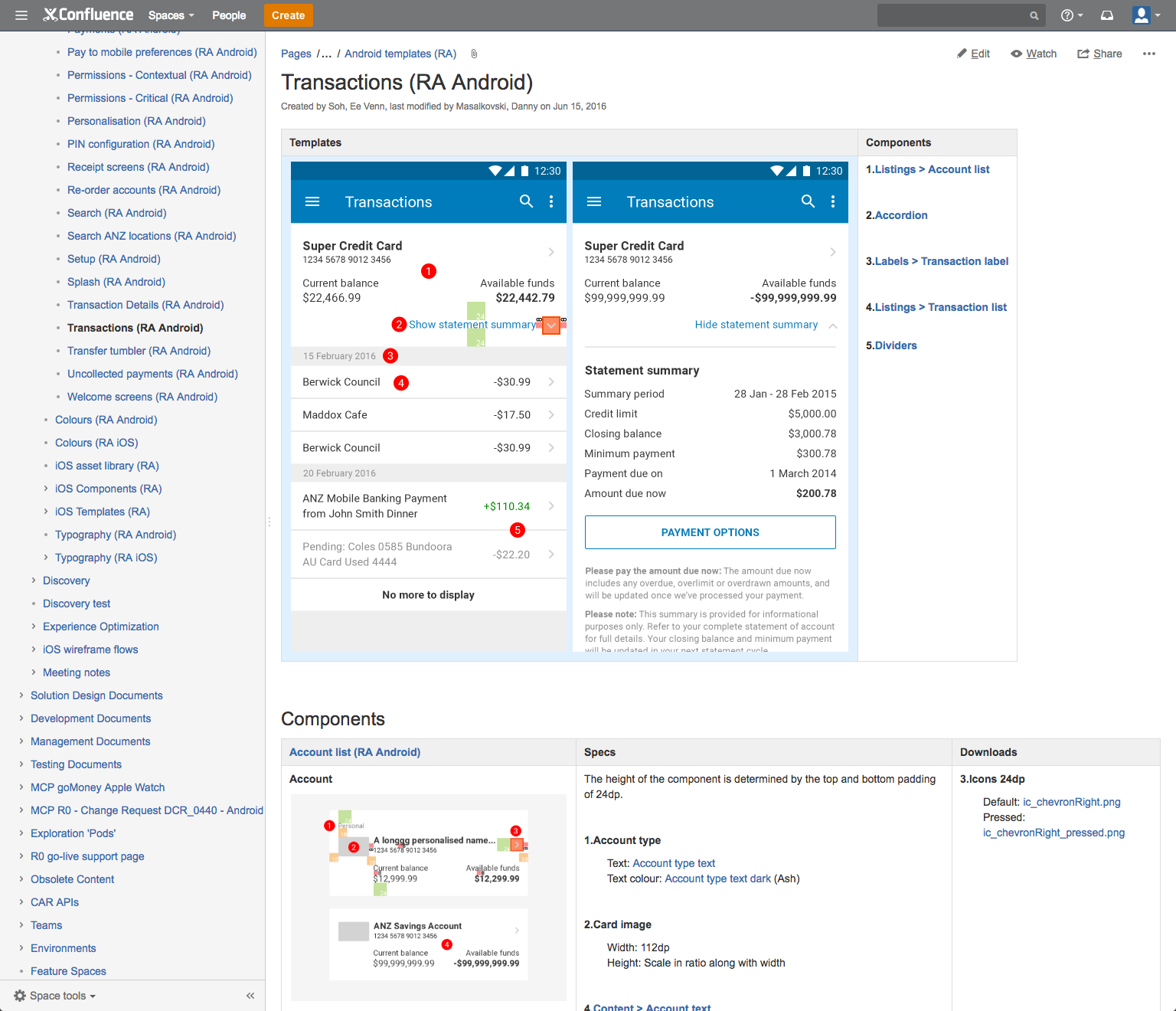
The objective of our new design setup is to have a modular approach that subdivides a screen (template) into smaller parts (components). The components can be then be independently created and then used on different screens.
We concept, apply, stress test all the components across multiple edge cases and scenarios and iterate on them to make sure we have a robust, flexible and future proof UI patterns.
Challenge: To have a UI pattern that will cater for all edge cases require deep understanding on the behavior, interaction and user flow of an existing feature within the product. It isn't well captured within ANZ, hence a lot of times, it is about working extremely close with BA and testers to figure that out.
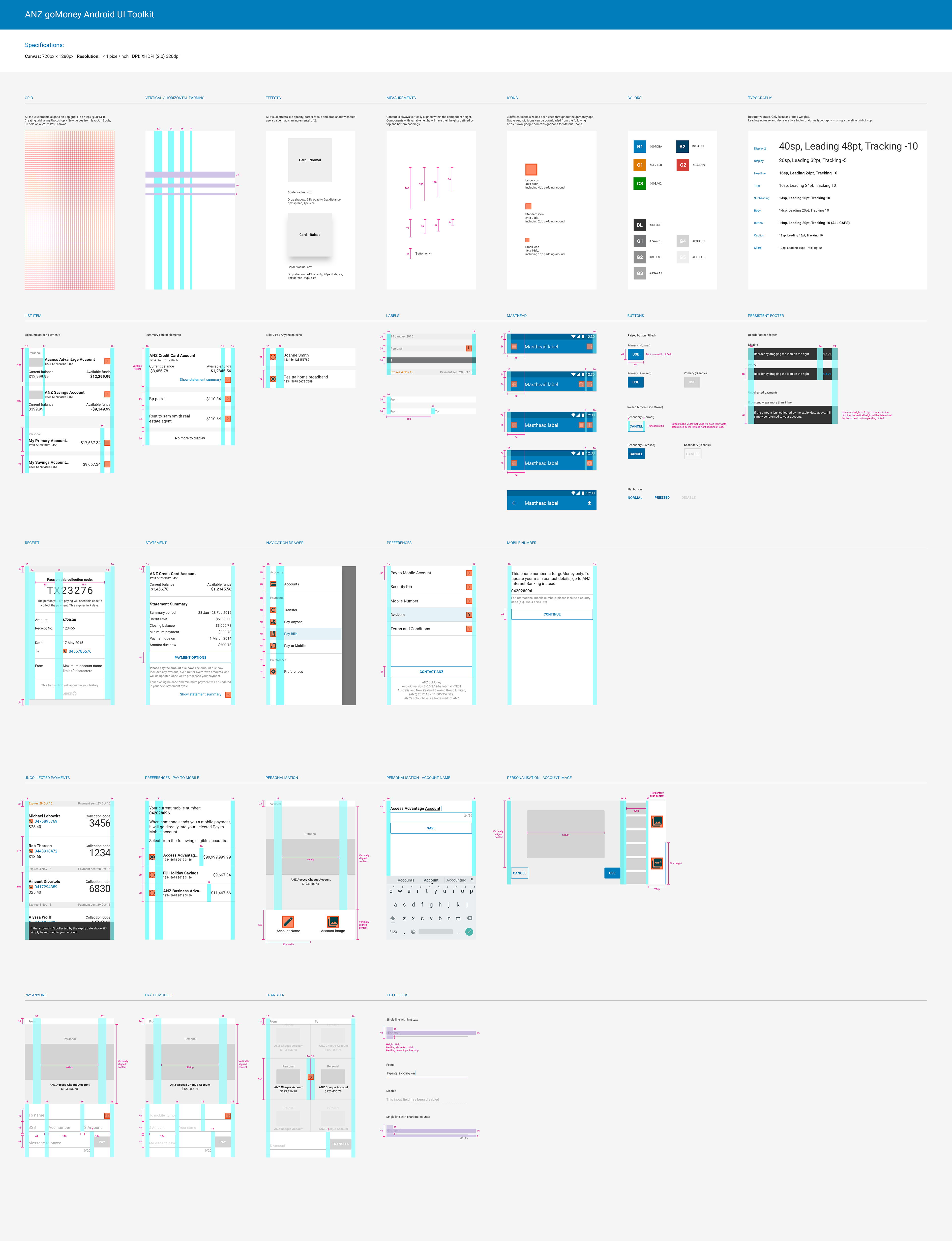
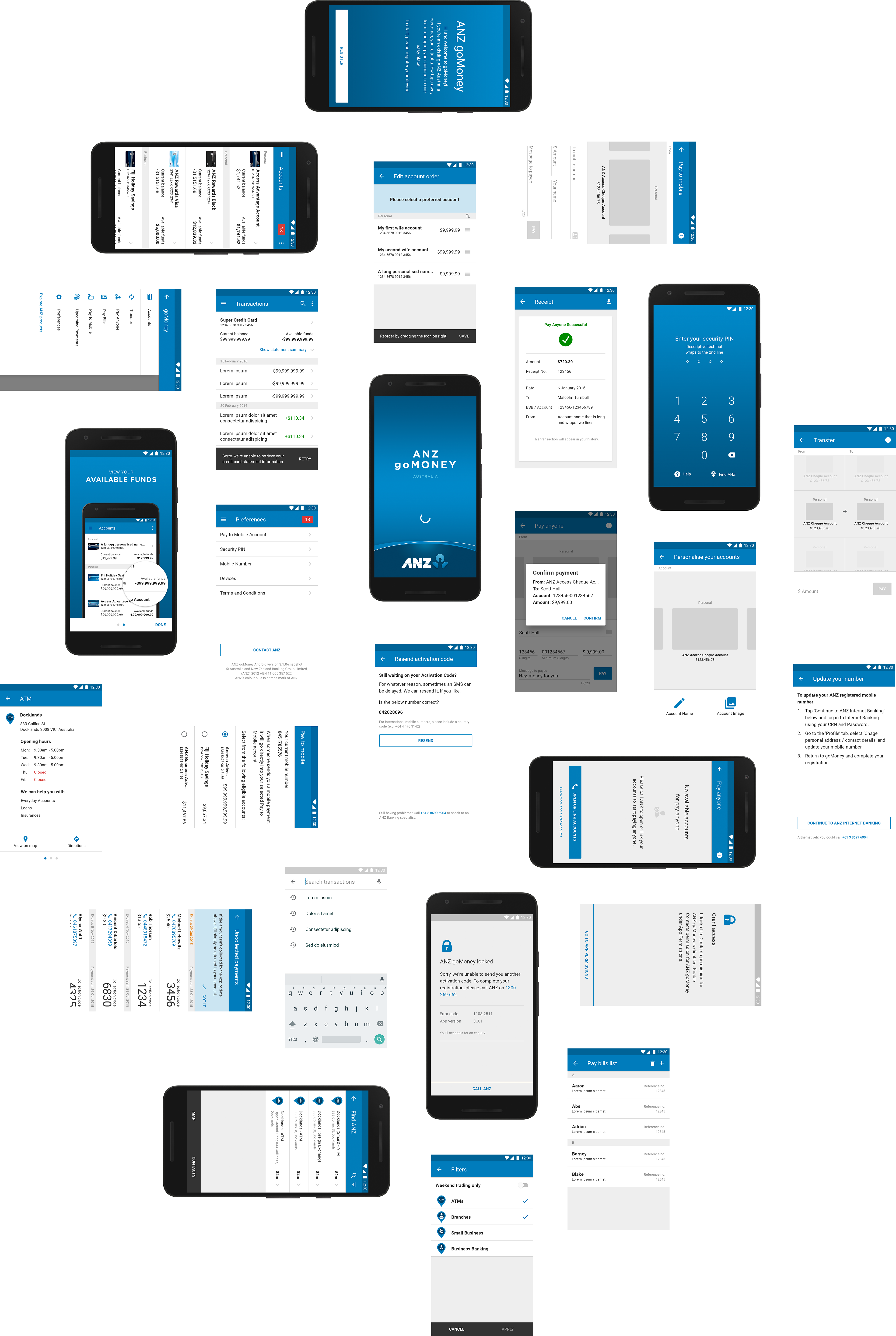
ANZ goMoney Android UI Toolkit: This .PSD UI toolkit was created initially to capture the majority of the screens and patterns within goMoney. We designed everything in @2x with a canvas size of 720 x 1280px in Photoshop.
Retrospective
Using Photoshop for UI design isn't the most ideal tool. However due to the slow procurement process within the organization and the fact that ANZ needs to liaise with many other design vendors that are still using Photoshop, has forced us to stay with Photoshop.
There is an article about creating the design in @1x as the standard process. I concur with the points listed. It is a much better approach and the author has the luxury of using Sketch.
However if you are designing in @2x (.PSD), this should be the approach:
• Convert your template into “pt” units so all typography will be resolution independent.
• On Mac, set your canvas resolution for 2x to 144ppi since 1x = 72ppi.
• Keep in mind that every pixels you used in Photoshop at 2x have to be able to divide by 2 to a round number to avoid sub pixel at 1x.
• Create all UI elements at vector shapes in Photoshop.
• When you need to change your entire file to 1x again, you just need to change the canvas ppi value from 144ppi to 72ppi to get to 1x.
The design team over at ANZ is now looking at migrating over to Sketch at some point. Winning!
Building blocks
Colours
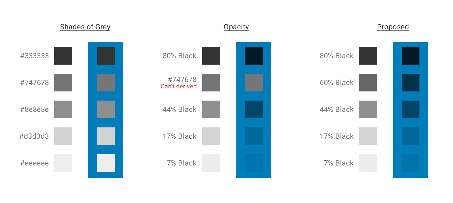
The app has a bad history of designing by 100 designers who come and go with everyone giving different design inputs and direction. Hence this has resulted the app having "50 shades of greys". We have looked at reducing the amount of colors to the essential part. Colours that are also aligned to different channels and the ANZ brand.

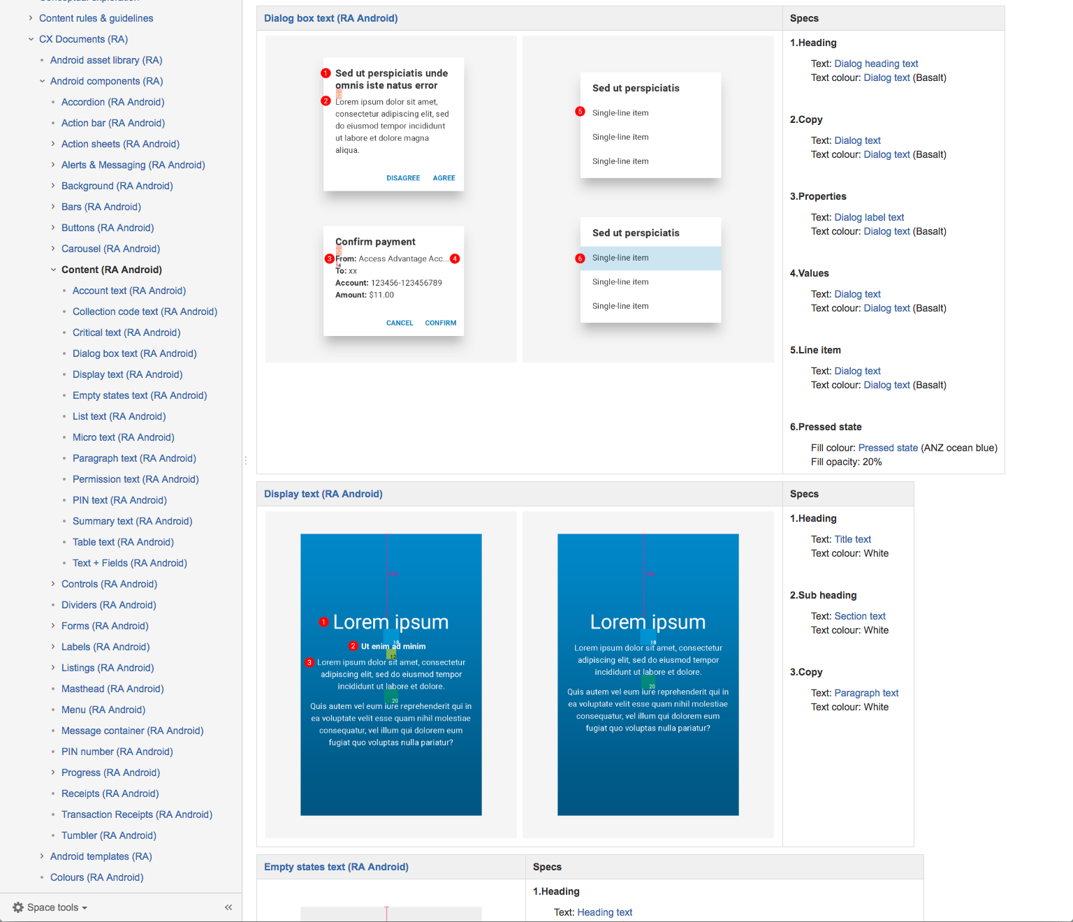
Text and background colours
Given that ANZ goMoney app largely been designed on either a white background or a blue background. We have derived a strategy to have text displayed with different degrees of opacity depends on whether your background is white or blue.
Colour choice rationales:
• Black or white text that is transparent remains legible and vibrant against background colour changes. This makes it more flexible than grey text in the same contexts.
• Although #747678 (ANZ Grey) is a brand colour but it should be retired for digital as it can’t be derived from Black (#000). Accessibiliy wise, it also fails on a grey background.
• To compensate #747678, we introduced 60% Black and accessibility wise it works great on white and grey backgrounds. It also matches #747678 (ANZ Grey) closely.
Typography
For Android, we are using Roboto as the design font. ANZ brand font is Myriad Pro however we are still sticking with OS native fonts for both iOS and Android for time being. One of the strongest rationale being iOS's system font comes with Dynamic Type and the dev team is already using built-in iOS text styles.
Typeface: Roboto
Weights: Regular or Bold
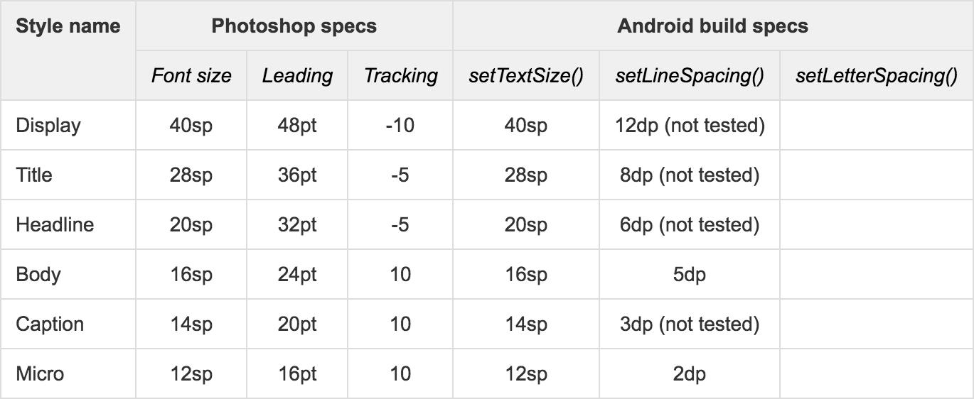
Unit: Scaleable pixels (sp) to allow type to be resized using accessibility features
Leading: Increase or decrease by a factor of 4pt
Baseline grid: 4dp
Default TextView API: setIncludeFontPadding() to false
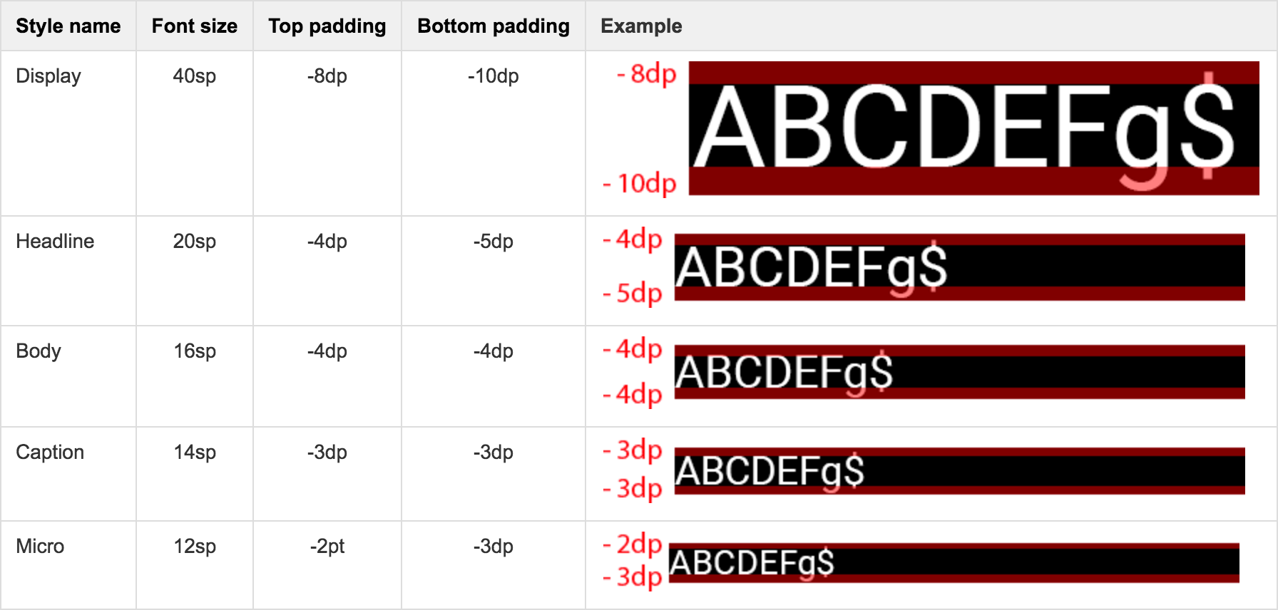
When it comes to visual regression testing, we are not aiming for a pixel perfect translation from design to build as we know that is impossible. What we are looking for is a build that is close to the design intention. Within the design specs, we do take into account of the top and bottom padding of a font size.
Since we are supporting only English letters (Latin scripts). We are comfortable with applying setIncludeFontPadding() to false to trim off some extra padding in a text view.
Leading & Tracking
We try to simulate leading and tracking in our typography with API like setLineSpacing() and setLetterSpacing(). In testing, setLetterSpacing() is a tricky attribute and hasn't resulted in an ideal output. Hence we have parked that aside for now.
For iOS:
iOS has an advantage in this aspect given that they have Dynamic Type (if you choose to use the system font, which we do). It will automatically adjusts tracking and leading for every font size. Another awesome thing about system font in iOS is that it automatically reacts to accessibility features, such as when bold text is enabled.
Font bounding box
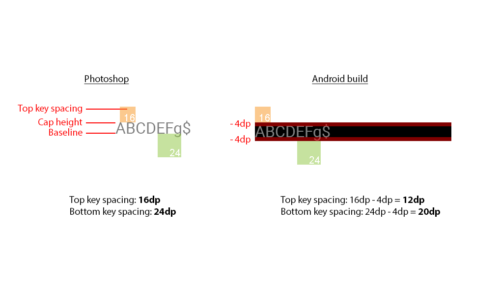
With our design, all UI are designed and arranged according to the text's cap height and baseline.
By default, each font comes with some extra top and bottom padding to cater for different characters and glyphs. We have listed out the padding spacing in font sizes that are used in the app. Below is the list of top/bottom padding for each font size after we applied setIncludeFontPadding() to false.
Design to build translation

Retrospective
Taken accessibility into consideration, as the user scales the font size in system settings, the intrinsic padding within a text view will increase as well. Hence the top/bottom padding within a text view has to be calculated dynamically.
So probably, we shouldn't be exerting too much visual control over how typography presented itself on screen?
Setting includeFontPadding() to false will only work great for Latin fonts. If we are going to start support non-Latin scripts, this will not work properly. Instead get the Font Metrics Object from the text view will be a better approach. With that, we can query different attributes on that font metric. With that font metric, we can get information such as where the descender line is.
TextView.getPaint().getFontMetrics()
For developers who want a more precise control over alignment and placement. Look at Google I/O 2016: Designer & developer communication video. It has an interesting solution for this.
Components
Templates
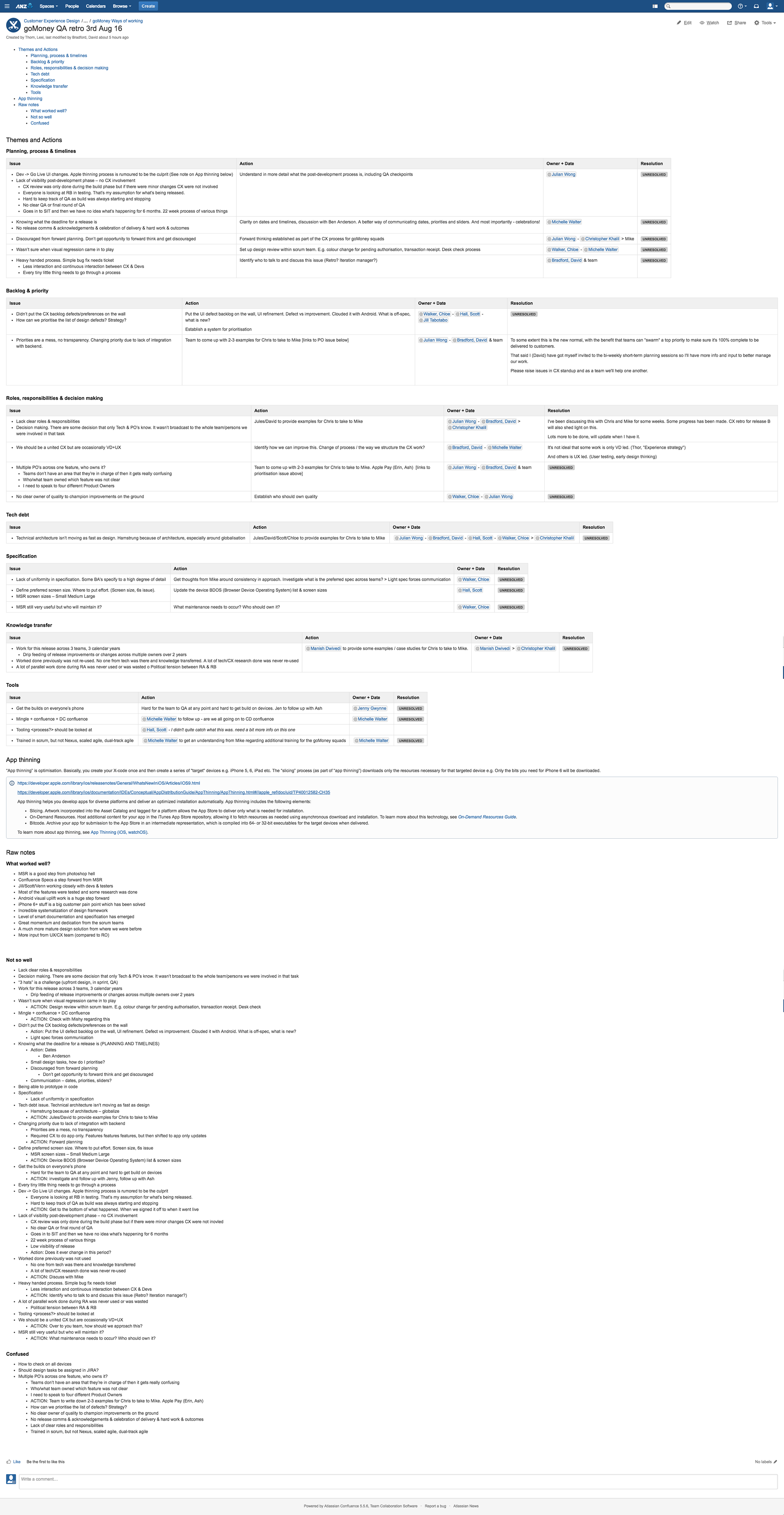
Confluence
We have begun to document all our design specifications on to Confluence. This is the source of truth. We made that decision as Confluence it the medium within ANZ that everyone has access to. Everyone will be able to contribute to it.
Retrospective
Generating design specifications manually is a pain. If we were to successfully migrate over to Sketch. We will be looking at using plugins like Measure https://github.com/utom/sketch-measure or Craft library https://www.invisionapp.com/craft to generate styleguides for us.
Challenge: However introducing 3rd party cloud services, eg: Dropbox, Adobe CC Library, etc are super tedious and arduous due to the strict IT policy in a banking environment.
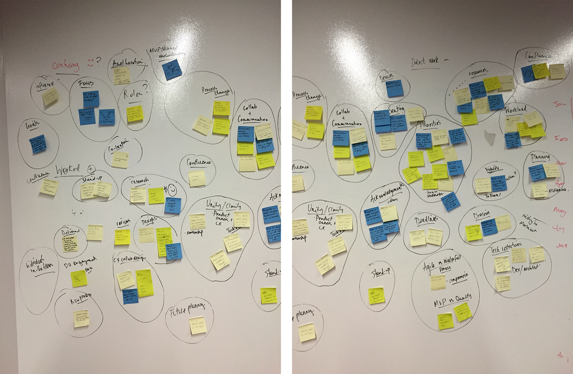
Retro
We had a retro session to go through what went well and what went wrong in this particular release. Notes were documented on to Confluence for future reference.